Louisa Fitzgerald on creating extravagant sets and costumes
The spectacular set and costumes in Victorian Opera’s upcoming production of English Eccentrics are an event of their own.
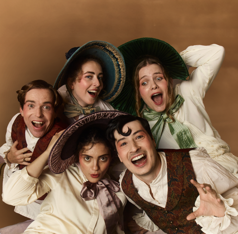
Loud pops of colour, backdrop of hand-painted clouds and extravagant makeup turn this little-known gem of a production into a real-life oil painting, showcasing designer Louisa Fitzgerald’s gift for immersive stages.
Louisa designs sets and costumes for theatre, opera and dance, and her practice is informed by a passion for design history. She was also the set designer for Victorian Opera’s The Grumpiest in the World (2023), as well as the costume designer for the Australian Ballet’s Storytime Ballet: Cinderella (2023).
Here, she talks inspirations (think John Galliano’s Dior runways and English landscapes), her typical style, and artistic process.
The beautiful painted backdrop of clouds makes the stage look ethereal. What drew you to this particular theme?
This opera spans seven individual stories, and almost twice as many locations. The linking visual idea is the pervasive grey weather of England; “Goose Weather” as English Eccentrics author Edith Sitwell describes it.
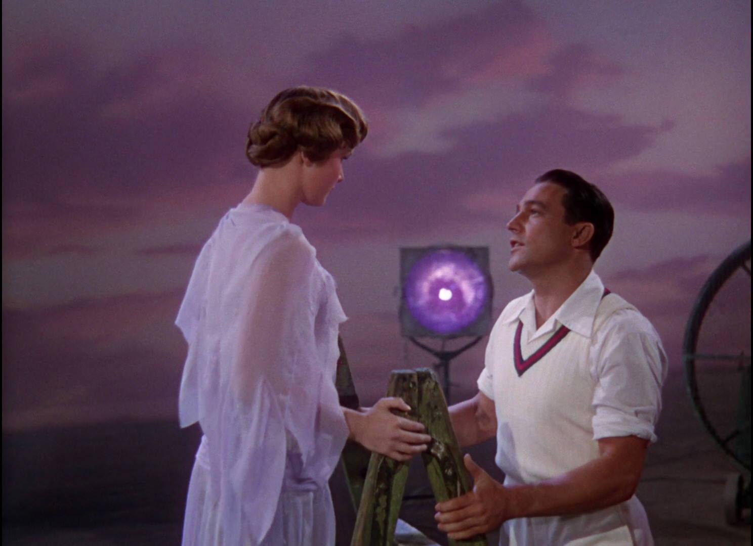
My research kept bringing me back to various oil paintings of the English landscape that show the sky as a mess of clouds using almost every colour but grey. I also was very inspired by a scene from the film Singin’ in the Rain, where Gene Kelly and Debbie Reynolds sing “You Were Meant for Me”. The way the figures contrast the painted pink backdrop behind them is so striking.
I want the characters of English Eccentrics to appear as bright spots of eccentricity against the all-consuming cloudy weather around them. The painted backdrops are also highly theatrical and slightly surreal, much like this wonderful opera.

The costumes are so eclectic, and Romeo Coates looks like it’ll shape up to be quite spectacular. What is your favourite costume in English Eccentrics and why?
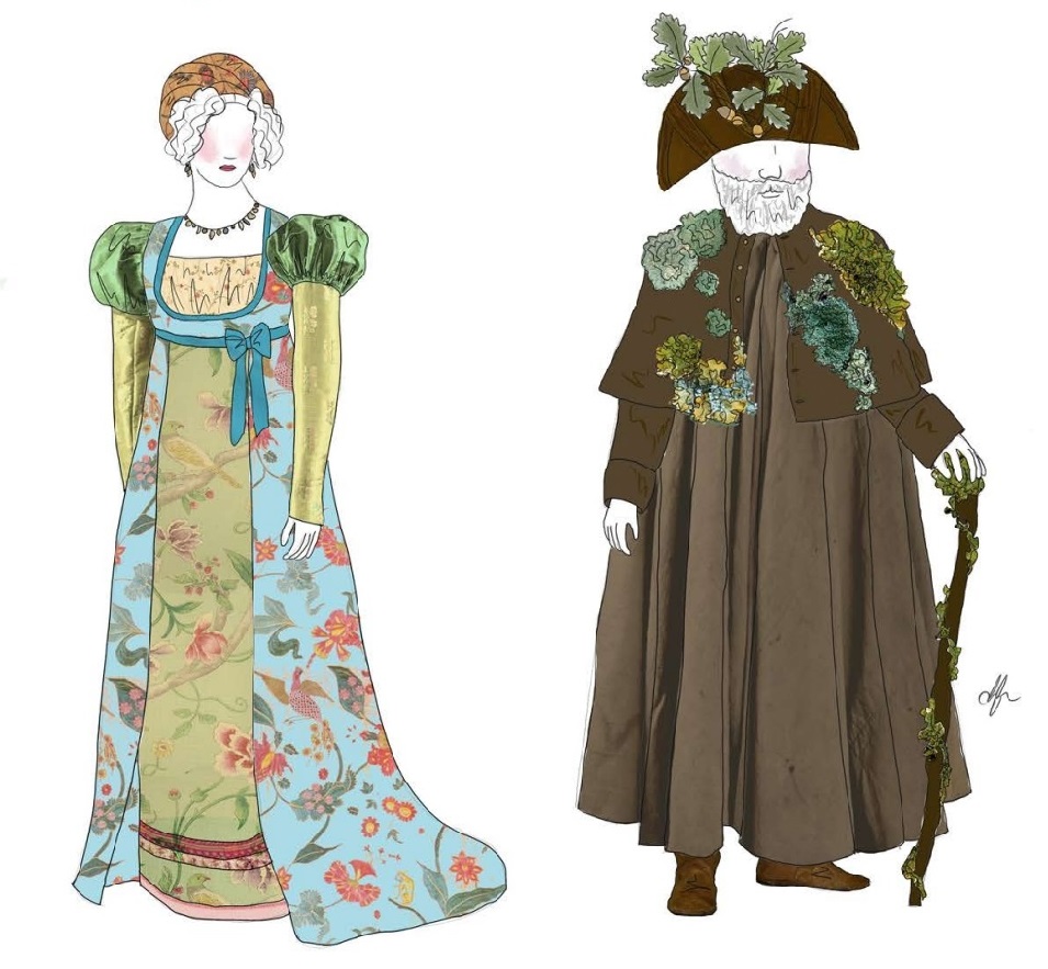
It’s hard to pick a favourite, but it’s between Princess Caraboo and the hermit Phillip Thicknesse.
In the spirit of Caraboo’s character, the entire costume is made from found fabric scraps and offcuts. Our incredible costume makers Fiona and Xander have done a beautiful job of making a gown fit for a princess out of an old bedspread and some cushion covers.
For Phillip Thicknesse’s costume, I also salvaged scraps of lace, hessian and yarn to hand make patches of moss that appear to have grown over Phillip’s cloak. Sewing that costume was quite meditative and I really enjoy turning fabric scraps into something new and beautiful.

Can you tell me a bit about your process for putting together a set? And to what extent does the set inform the costume design?
Once I had an idea of conceptually where the set was going, I moved into model making pretty early. I built a lot of model rostra and furniture and just spent time exploring various configurations and arrangements. It’s a lot of play and experimentation.
I wouldn’t say the set informed the costumes, I don’t think it’s as hierarchical as that. As this show is really about featuring the eccentric characters, it felt natural to have the costumes pull focus from the space with bright colours and patterns that contrast the clouds that cover both the set and the costumes of the ensemble.
The show almost looks like a painting has come to life. Can you tell me about your inspirations?
I have always loved the illustrated fashion plates from this era. The detail in clothing, hair and hats, the way the colours have faded over the years into gorgeous pastel tones. They’re drawn with such a fabulous attitude and style.
I love the idea of finally getting to see them come to life on stage. I’ve also been very inspired by John Galliano’s Dior runways. The rich detail and stylised theatrical makeup create such a feast for the eyes. I find myself going back to those references a lot.
Is there anything you’d say is quintessentially “Louisa” in your designs? How do you make a design your own?
I wouldn’t say I have a signature or anything. Different productions demand different approaches, but I’m not very subtle when it comes to using colour.
My illustrations are often quite cartoonish and that translates to graphic shapes and blocks of colour on stage. I try to avoid using black, but it always ends up creeping in somewhere.
